- Solar energy blog
- Meet the new map-centric design process: Redesigning our software's design layout
Meet the new map-centric design process: Redesigning our software's design layout
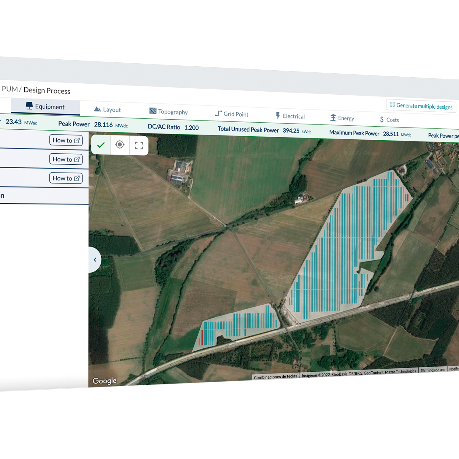
This is how we redesigned our design process to make RatedPower a fully interactive software. The new design process shows the layout in each step, an easier way to see how changes in your electrical equipment or location impact on the design.


Agathe Verdier
Design Manager
Agathe is a product and user experience designer, brainstormer, creator, thinker, and questions-asker who likes working in solving complex problems down to something useful, valuable and ease of use.
Nearly two years ago she joined Ratedpower product team. Leading the user experience and user interface design of the software, pvDesign, She is responsible for understanding the users and business needs, and creating valuable user experience, as well to generate meaningful social impact.
Content
More than 1,400 users enter RatedPower software daily and design hundreds of projects, to fasten and optimize their PV plant installation. Still, we realized it was time for an upgrade. We gave our software’s “Design process” a complete design overhaul.
But, why?
Our guiding principle for this year is making our platform a fully interactive software. Allowing you a much quicker and easier way to iterate your designs and find the most optimal ones. So teams down the PV project funnel spend less time polishing the results.
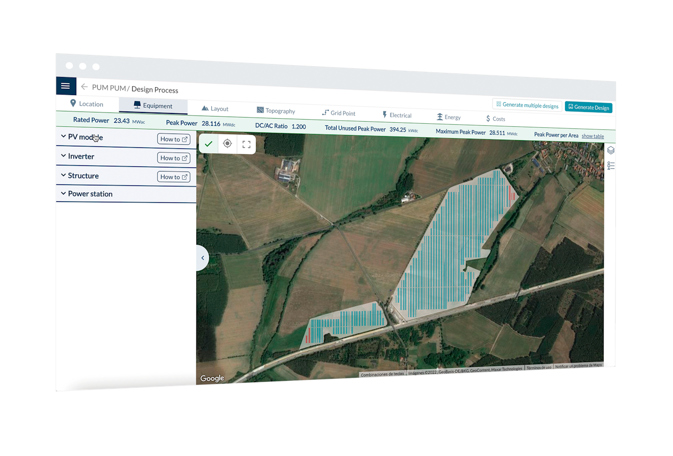
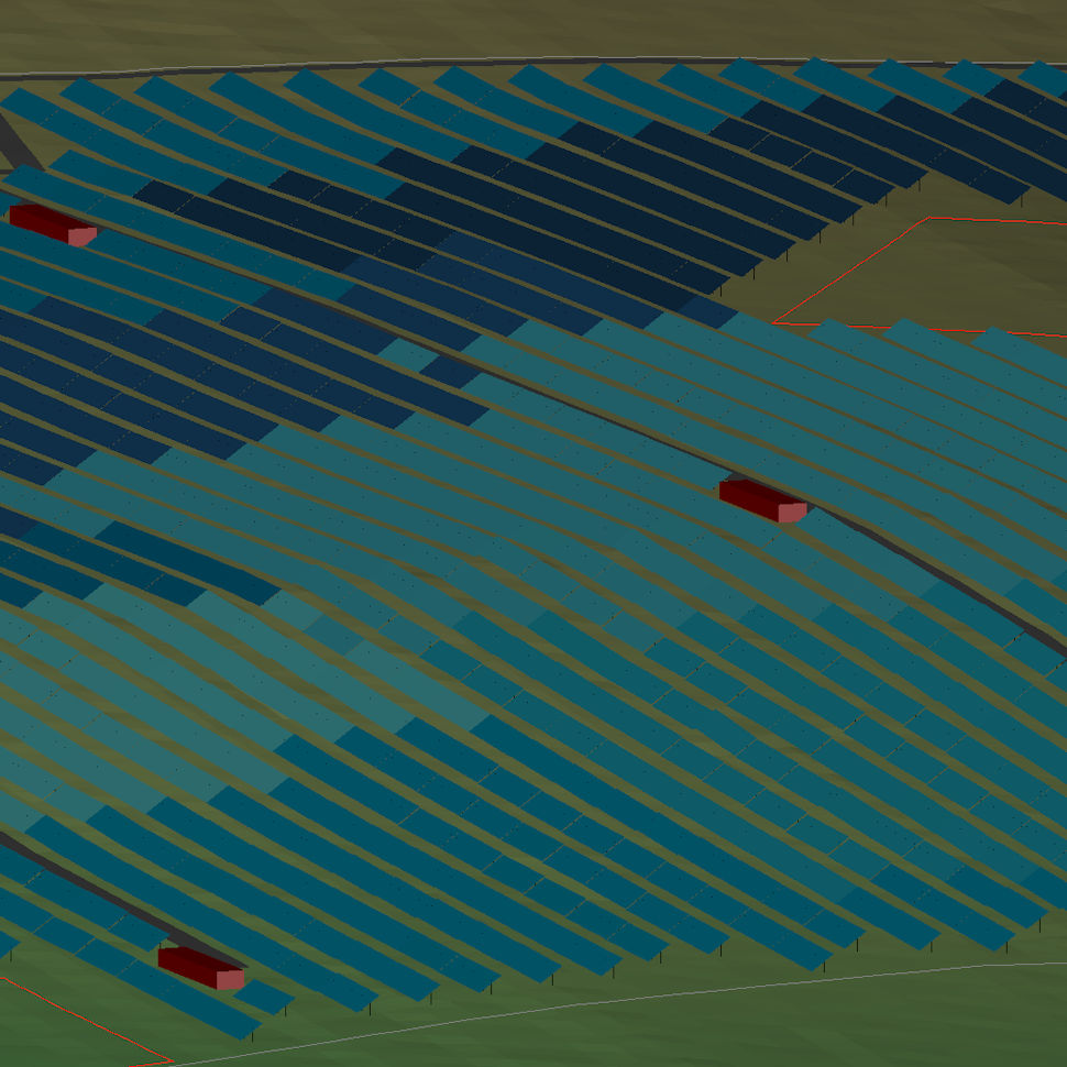
The new design process shows the layout in each step. It makes it super easy to see how changes in your electrical equipment or location impact on the design.
We want to shape and build a better future of renewable energies, and for that we need to be comfortable taking risks.
For that we needed to go step by step, and start by redesigning the design process workflow, by making the map the central element. With this redesign, you can visualize how changing inputs affects your layout. It removes the need to jump between tabs.
You can get a bird’s eye view of all your design’s parameters. Just by looking at the map and check your estimate power values at all times. This new workflow accelerates and optimizes a design within RatedPower.
Here are some of the highlights:
Input arrangement
We’ve re-arranged the inputs and categorized them into their corresponding tabs. Main parameters, such as the number of inverters or the DC/AC ratio that define the plant size, are now at the beginning of the Design Process, just after defining your site characteristics and main equipment. The process of designing your PV plant will now be much more fluid.
User Interface (UI) redesign
Having the map as the center element of the design process, allows users to see in real time how changing their inputs affects their layout. For example, you can now tweak your equipment or refine PV plant features and see the changes in real time directly on your layout.
New parameters as inputs
You can set the Rated Power and Peak Power directly as inputs. Previously you needed to define the number of inverters and the DC/AC ratio to do so. Now you can choose which of those parameters you want to define and it will calculate the rest accordingly.
We also added the same workflow for defining the distance between structures: now you can set it not only with the Pitch distance, but also with the clearance distance or the Ground Coverage Ratio.
This redesign is the cornerstone of future interactive processes that will enable our clients to create their sites inside RatedPower from scratch.
Revamping UI foundations
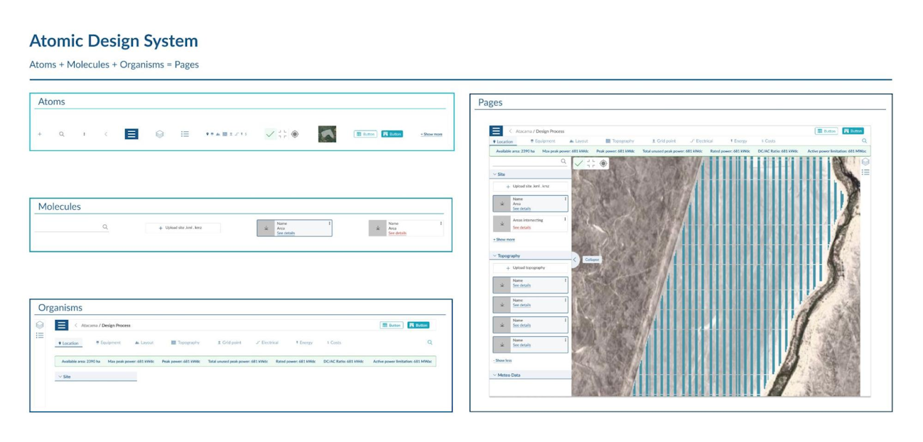
With the redesign launch, we upgraded our interface design too. By building a strong design system which will help you intuitively navigate and successfully interact with different sections of RatedPower without confusion.
Updating our software design system
A design system is a collection of reusable components, guided by clear standards, that can be assembled together to build any number of applications. We created a visual language based on color, typography, sizing and spacing to improve product quality.
Design system provides a core map from the basic to the more complex components helping us to build a strong and well communicated product. Design system is a product itself, a product to build consistent new products.
The new update is still gradually rolling out, with more features slated to ship by the end of the year. We hope you are as excited as we are
Latest stories
Related posts
Product and corporate updates
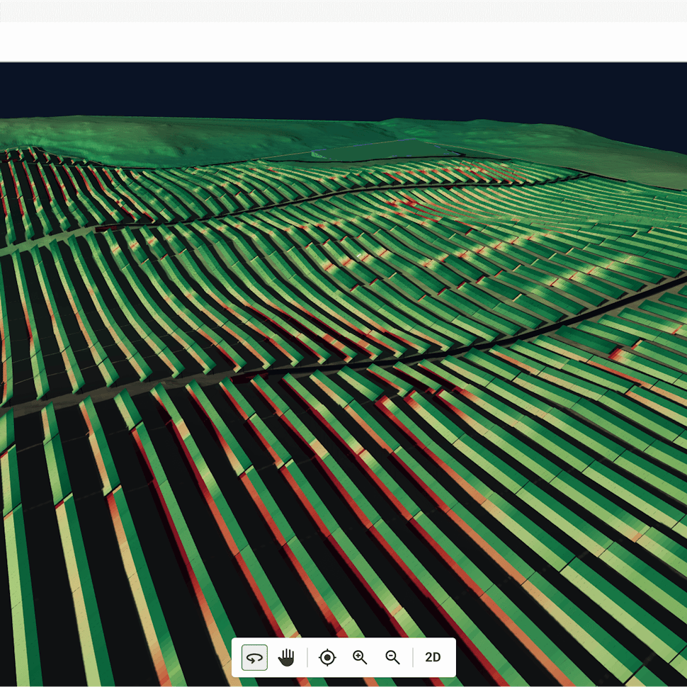
Revolutionizing PV plant design: The power of 3D energy simulation
Discover how RatedPower’s 3D Energy simulation tool transforms PV plant design by moving beyond flat terrain assumptions to comprehensive 3D analysis.
Updated 10 FEB, 26
Product and corporate updates
Enverus’ Solar ROI calculator: assess PV plant’s profitability
Find out how much you could save by integrating Enverus tools into your solar design workflow, as we explain how our solar ROI calculator works.
Updated 5 AUG, 25

Product and corporate updates
Exploring the RatedPower CAD import tool
Discover the RatedPower CAD import tool, an intuitive and time-saving feature that directly integrates DWG CAD files and shapefiles into our platform.
Updated 17 JUN, 25
- RatedPower
- Solar energy blog
- Meet the new map-centric design process: Redesigning our software's design layout
 Watch a demo